Articles / LORQAI
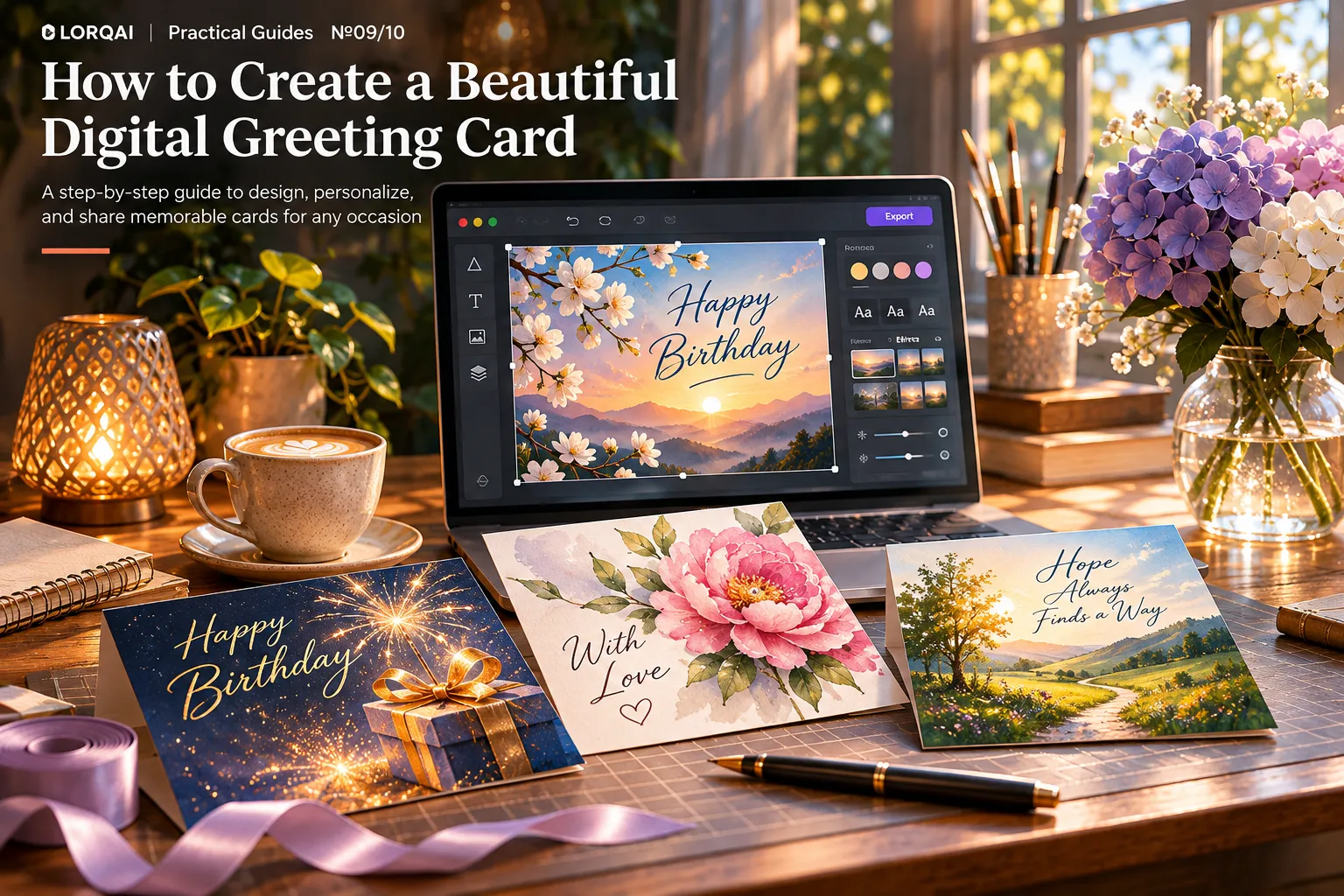
How to Create a Beautiful Digital Greeting Card
Create a thoughtful digital greeting card in eight simple steps. Learn to choose a size, write a personal message, design readable layouts, export files, and share with confidence.
Introduction
A greeting card does not need complicated animation, expensive software, or a perfect photograph to feel special. Sometimes a few thoughtfully chosen words, one strong image, and enough space around them are all you need. The part people remember is rarely the number of decorative elements. It is the feeling that someone made this card for them.
You can create a digital greeting card for a birthday, an anniversary, a thank-you, a new beginning, or simply to remind someone that they matter. This guide walks through the process from a blank canvas to a card that is easy to read, pleasant to look at, and ready to send. You do not need design experience.
Make a digital greeting card in eight steps
- Choose the person, occasion, and one feeling you want the card to convey.
- Decide where the recipient will see it: phone, email, social post, or print.
- Start with a suitable canvas and leave comfortable margins.
- Select one main image or visual idea, rather than several competing decorations.
- Write a short, specific message in your own voice.
- Use readable type and a restrained color palette.
- Export a clean version and check it on a phone at actual viewing size.
- Send it in a thoughtful way, and keep the editable original for later.
Make a digital greeting card in eight steps
If you have only ten minutes, focus on steps 1, 5, and 7. A clear intention, an authentic message, and a legible result are worth more than an elaborate template that no one can read.
Step 1. Start with the person, not the template
Before opening a design app, finish this sentence: “When they open this card, I want them to feel ______.” Your answer might be celebrated, encouraged, loved, appreciated, or quietly understood.
Now consider who will receive it. A playful card for a friend who enjoys absurd humor probably needs different colors and language from a tender anniversary card or a thoughtful thank-you to a teacher. Neither has to be formal. Both need to sound like something you would actually say.
Try collecting three details: an occasion, one small memory, and one wish. For example: “graduation,” “the late-night study sessions at our kitchen table,” and “more brave first steps.” These details are the beginning of a personal card, not extra decorations you must somehow squeeze onto it.
A useful rule: choose one central idea. If your message is about new beginnings, your imagery could suggest a path, an opening window, or morning light. If it is about friendship, a shared memory may work better than a generic bouquet.
Step 2. Choose the destination before choosing the size
There is no single pixel size that is ideal for every digital greeting card. A card sent in a chat, embedded in an email, shared as a post, or printed later may need a different shape and export.
Here are practical starting canvases, not universal platform requirements:
Format and size reference
- Portrait image sent to a phone — Helpful starting canvas: 1080 × 1350 px (4:5); What to check: Readability when opened in the recipient’s app
- Square card for easy sharing — Helpful starting canvas: 1080 × 1080 px (1:1); What to check: Whether the service adds its own crop or preview
- Landscape image in an email or web page — Helpful starting canvas: 1200 × 630 px (about 1.91:1); What to check: Text size and email layout on mobile
- 5 × 7 in printed card — Helpful starting canvas: Around 1500 × 2100 px at 300 PPI; What to check: Printer’s bleed, paper size, and color requirements
Step 2. Choose the destination before choosing the size
The first three are reasonable design examples; they are not guaranteed to display uncropped in every messaging or social platform. For any destination, confirm the service’s current guidance and send a test to yourself. A high-resolution file will not help if a small preview hides your message.
If you might print the card later, save your editable artwork at a suitably large size. Do not assume that changing an image from 72 to 300 PPI in its metadata will create missing detail. The actual pixel dimensions and intended physical print size matter.
Step 3. Pick one visual idea that supports the message
A good greeting card usually has a visual focal point: a flower, a photograph, a symbolic object, a simple illustration, or a short headline. Everything else should help the eye find that point.
For a birthday, you could use playful shapes or a single colorful ribbon. For an anniversary, perhaps two abstract forms meeting. For encouragement, an archway opening toward light. There is no need to combine balloons, confetti, flowers, stars, fireworks, and five different fonts just because the editor offers them.
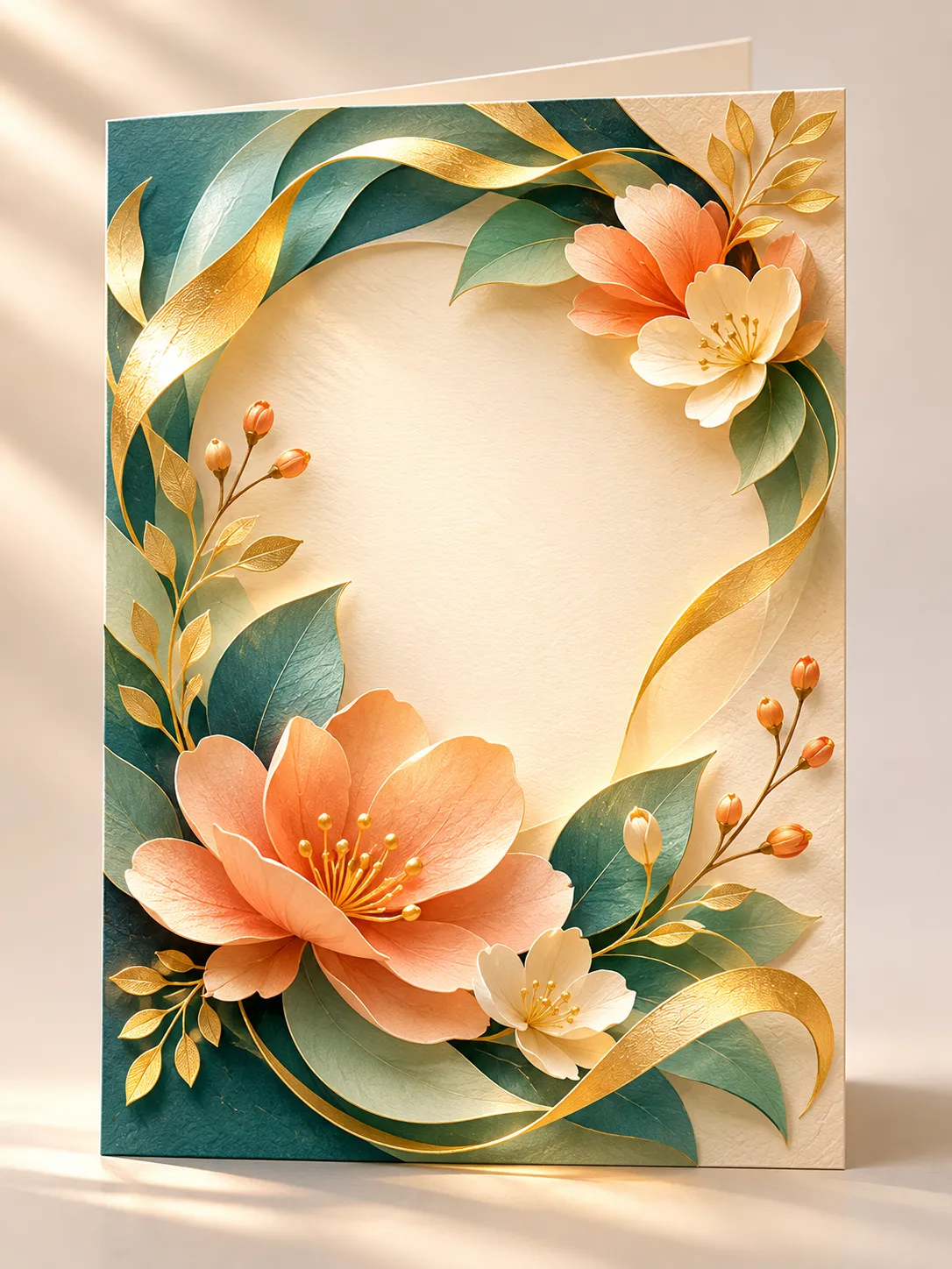
The floral example above uses layered leaves and warm gold accents around an open, quiet center. It is deliberately unfinished: the blank space is where the recipient’s personal message belongs. That is not wasted space. It makes the message easier to read and gives the design a place to breathe.
Try this: zoom out until the card is the size of a phone screen. Can you recognize the main idea instantly? If your eye has nowhere to settle, remove an element before adding another.
Step 4. Write something only you could have written
You do not need a poem. Two specific sentences can feel far more personal than a paragraph of polished but generic compliments.
A simple message pattern is: a genuine detail + what it means to you + a wish for what comes next.
For a birthday: “I still smile when I think about our rainy-day picnic that somehow turned into the best afternoon. I hope this year brings you more wonderful accidents.”
For an anniversary: “I love the ordinary evenings when we end up talking long after dinner is over. Here’s to many more of those little moments.”
For a thank-you: “You noticed I was struggling before I knew how to ask for help. Your patience changed that week more than you realize.”
For encouragement: “You’ve already done the difficult part: beginning. Whatever happens next, I hope you give yourself credit for that.”
These are newly written examples, not messages you have to copy exactly. Change the memory and the tone to suit your recipient. If you are unsure whether a private story would embarrass someone, leave it out—especially when the card might be posted publicly.
A fill-in message you can adapt
“Dear [Name], I keep thinking about [specific shared moment]. What I remember most is [small detail or feeling]. I’m wishing you [one sincere hope] as you begin [new year, chapter, or adventure]. With love, [Your name].”
Read it aloud. If it sounds more like a marketing slogan than a human message, make it simpler. The recipient should recognize your voice.
Step 5. Make the words easy to read
A beautiful background can make text difficult to see. Pay attention to three things: hierarchy, contrast, and breathing room.
Start with one main message, such as “Happy Birthday,” and one short personal note. Make the main line visually prominent. Keep the note smaller, but not so small that it disappears on a phone. Choose no more than two complementary typefaces unless you have a clear reason for more.
If the background is busy, place the text on a calm solid-colored panel, soften the area behind it, or move it to open space. Do not rely on pale gray text over pale flowers. As a helpful accessibility benchmark, W3C guidance recommends a contrast ratio of at least 4.5:1 for normal text and at least 3:1 for large text. These are useful design targets even when the card is an image rather than a website interface.
Keep the most important words away from the edges. A little extra margin protects them from accidental trimming, cropping, and cramped mobile previews. And proofread names and dates twice—those are often the first details a recipient notices.
Step 6. Build it in an editor, even if you are a beginner
You can work in a design editor such as Canva or Adobe Express, or use another tool with a blank canvas, text boxes, and image export. Menu labels can change, but the basic workflow is similar.
Step 6. Build it in an editor, even if you are a beginner
- Create a new design in the shape you chose in step 2.
- Add a background color, one photograph, or a single artwork layer.
- Move that artwork until you have a clear area for your message.
- Add the headline and the personal message as editable text boxes.
- Adjust the font, spacing, alignment, and contrast.
- Save the editable design, then export a separate shareable file.
Step 6. Build it in an editor, even if you are a beginner
In Canva, the current general export path is Share → Download, followed by a file type and the available size or quality options. You can also start from a greeting-card template, but replace the sample language and make sure the layout genuinely fits the person. Adobe Express offers similar design-and-export workflows; check the controls in the version you use.
An AI image generator can help create an original backdrop or illustration. A useful image prompt might be:
“Portrait 4:5 layered-paper floral artwork for a thoughtful birthday greeting card. Warm ivory center with generous blank space for a later text overlay; peach blossoms, dark teal leaves, restrained gold accents around the outer edges; elegant soft lighting and tactile paper texture. No letters, words, logos, or watermarks.”
Generate the artwork first, then add the actual greeting in a design editor where you can check every letter. Do not depend on a generated image to spell a recipient’s name or a special date correctly. Preserve the editable source and review any applicable image-use terms before public or commercial distribution.
Step 7. Export the right file, not just the biggest file
For most static digital cards, PNG and JPG are sensible starting points. PNG is often a good choice for illustrated designs with text and sharp edges. JPG can be smaller for photographic cards when exported at sufficient quality. Choose based on the design and where you plan to send it.
For printing, follow the print provider’s instructions. A print-ready PDF may need bleed and crop marks, but these should not be added by guessing. Color conversion and paper can change how a design looks; a bright screen is not an accurate preview of every printed result.
Before sending, inspect the exported file instead of assuming the design editor showed the final result. Check that the greeting is not blurry, the name is correct, and the card has not acquired strange borders. Make sure any decorations near the edge do not cover the message.
If the file is unexpectedly huge, try a sensible export size and appropriate compression. If text is soft, inspect the pixel dimensions and export settings rather than repeatedly resaving the same low-quality file.
Step 8. Test it as the recipient will actually see it
Send the card to yourself or another device before delivering it. Open it in the messaging app, email client, or gallery the recipient is likely to use.
Look for these five things:
Step 8. Test it as the recipient will actually see it
- Does the main message remain readable without zooming?
- Is the name spelled correctly, and are all dates accurate?
- Does the preview crop anything important?
- Are the colors and contrast comfortable to look at?
- Does the card still feel personal, rather than like a generic advertisement?
Step 8. Test it as the recipient will actually see it
If any answer is no, return to the editable design and fix the source. Avoid making a copy of a downloaded, compressed copy and editing that repeatedly.
When you share the card publicly, do not include private addresses, phone numbers, school information, or a personal photograph without permission. When posting an image on a website, provide meaningful alt text if the platform allows it. For an email, consider writing the main greeting in the message body too, so it remains accessible if the image fails to load.
Three simple design directions to try
Quiet and elegant. A warm cream background, one botanical illustration, a dark green headline, and a short handwritten-sounding message. Best when the words matter most.
Bright and playful. One saturated background color, bold shapes, a friendly headline, and a funny personal memory. Best for someone who enjoys cheerful, energetic surprises.
Cinematic and reflective. A photograph or an atmospheric landscape with a calm text area, a thoughtful message, and very little decoration. Best for an anniversary, a long-distance friendship, or a meaningful new chapter.
These are starting points, not rules. The strongest card is the one that feels right for its recipient.
A ten-minute example: a birthday card for a friend
Imagine you want to make a card for someone who turns ordinary plans into adventures. Begin with a square 1080 × 1080 canvas for a simple phone-friendly share. Use a soft teal background and one illustrated orange paper boat. Place a short headline above it and leave space for two lines below.
Write: “Happy Birthday, Sam. Here’s to more wrong turns that become our favorite stories.” Check that the name and message can be read comfortably on your phone. Save an editable copy and export as PNG. Send yourself a test before sharing.
That is already a complete card. It does not need twenty decorative objects or an animated soundtrack. Its personal memory does the work.
What is the best size for a digital greeting card?
There is no universal size. Choose a canvas for the destination and test it. A 1080 × 1350 portrait or 1080 × 1080 square can be a useful starting point for a static phone-shared card, but each platform may crop previews differently. Print dimensions are a separate decision.
Should I use PNG, JPG, or PDF?
Use PNG for most illustrated cards with crisp text, or high-quality JPG for photo-heavy designs when file size matters. PDF is useful when you need a print-oriented document and the printer accepts it. A recipient opening a simple phone message usually does not need a press-ready PDF.
Can I make a digital card for free?
Yes, using a free design editor, an app you already own, or a simple combination of an image and text boxes. Some templates, fonts, illustrations, export controls, and advanced features are paid; inspect licensing and plan restrictions before choosing them.
Can AI create the entire card?
AI can help with imagery and drafts, but you should verify spelling, names, layout, image rights, and the personal message. For a dependable result, generate the artwork and add final text manually in an editor.
How do I keep a greeting card from looking cluttered?
Remove extra decoration, use one focal image, limit your typefaces, give the words room, and view the design at phone size. If everything competes for attention, nothing feels important.
How do I send it without ruining its quality?
Export a correctly sized file, preview it on another device, and use a sending method that keeps sufficient resolution. Some messaging apps recompress image messages; sending as a document or file can help when maintaining the original file is important.
The idea worth remembering
A digital greeting card is not really about graphics software. It is about translating a feeling into something another person can open, read, and keep. Start with the recipient, make one thoughtful choice at a time, and test the final result where it will actually be seen.
The most memorable part is rarely the template. It is the detail that could only have come from you.
Listen & explore
- Canva Help Center — Download or save designs to your device (external platform)
- Canva Help Center — Choose the right download file type (external platform)
- Canva — Design and print custom thank-you cards (external platform)
- Adobe Express — Designing for print versus screen (external platform)
- Adobe Express — How to prepare print-ready files (external platform)
- W3C WAI — Understanding contrast minimum (external platform)