Articles / LORQAI
How to Print Digital Art Without Losing Quality
Learn how to prepare digital artwork for printing: pixel dimensions, 300 PPI, cropping, bleed, file formats, color profiles, paper choice and a simple print-ready checklist.
Start here: the five-minute answer
Your digital artwork looks beautiful on a screen. Then you order a print and discover soft edges, cropped details, or colors that feel completely different. The problem is rarely solved by changing a single “DPI” setting.
For a good print, you need enough real pixels for the finished size, the right proportions, a sensible file format, and color settings that match the printer’s workflow. The paper and printing process matter too.
If you remember only one rule, remember this: choose the physical print size first, then check whether your artwork has enough pixels at that size. Do not enlarge a tiny file and assume that setting it to 300 DPI adds detail.
Do these five checks before you order
- Choose the finished size: for example 8 × 12 inches or A4. Specify whether you want a white border or printing all the way to the edges.
- Open the original file and check its actual width and height in pixels. Do not use a social-media download, thumbnail, or screenshot if the master is available.
- Compare the image proportions with the paper. A 2:3 artwork fits 8 × 12 inches; it does not fill 8 × 10 inches without cropping or adding borders.
- Ask the print shop which format and color profile it wants, and whether it needs bleed. Keep a copy of the untouched master.
- Order a small test print if the artwork or colors are important, especially before paying for a large or multiple-copy run.
1. Understand PPI without the jargon
PPI means pixels per inch. It describes how many pixels of your image occupy each inch of the physical print. A higher number usually means finer detail when the print is viewed close up.
DPI means dots per inch and often describes the printer’s own ink-dot behavior. People use “300 DPI” casually when they really mean a 300 PPI image. For preparing digital artwork, start with the file’s pixel dimensions and intended paper size.
A common target for detailed small prints is around 300 PPI. This is a practical reference, not a law of physics: larger wall art often looks good at lower PPI because it is viewed from farther away. Ask your print provider if you are unsure.
The only calculation you need
Required pixels = finished size in inches × target PPI.
Example: an 8 × 12 inch print at 300 PPI needs about 2400 × 3600 pixels. For a print sized in centimeters, divide each dimension by 2.54 to get inches, then multiply by the chosen PPI.
If your image is 2400 × 3600 pixels, it gives 300 PPI at 8 × 12 inches, 200 PPI at 12 × 18 inches, and 150 PPI at 16 × 24 inches. The pixels have not changed; only their density on the paper has.
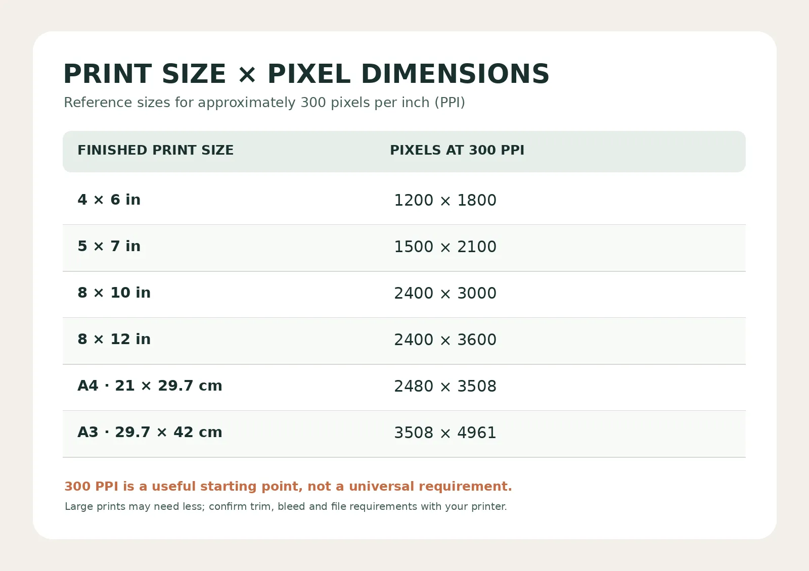
Quick reference: common print sizes at about 300 PPI
- 4 × 6 inches: 1200 × 1800 pixels.
- 5 × 7 inches: 1500 × 2100 pixels.
- 8 × 10 inches: 2400 × 3000 pixels.
- 8 × 12 inches: 2400 × 3600 pixels.
- A4 (21 × 29.7 cm): approximately 2480 × 3508 pixels.
- A3 (29.7 × 42 cm): approximately 3508 × 4961 pixels.
How to use the table
Find your intended finished size. Compare the listed pixel count with the actual image dimensions. Your image does not have to match the example exactly; these are planning numbers for approximately 300 PPI, not file-upload limits.
Check the aspect ratio as well. A photograph can contain enough total pixels and still require cropping to fill a differently shaped paper size. Sizes shown are for the finished artwork area, excluding any extra bleed requested by the printer.
2. Check the file you actually have
On Mac, select the image in Finder and choose Get Info to see its dimensions. On Windows, right-click the file, choose Properties, then Details. On an iPhone, open the image in Photos and tap the information control or swipe up. On Android, look for Details or Info in the photo app; the wording varies.
A file size such as “4 MB” does not tell you whether it has enough pixels. Compression affects megabytes, while dimensions such as 3000 × 4500 tell you how many pixels exist.
If your editor shows width, height, resolution, and a Resample option, turn off Resample before checking how different print sizes change the effective PPI. This prevents an accidental change to the number of pixels.
3. Changing 72 to 300 does not create detail
Suppose an image contains 1200 × 1800 pixels. At 300 PPI, those pixels can cover 4 × 6 inches. At 150 PPI, the same pixels can cover 8 × 12 inches. Simply editing the resolution metadata does not add sharpness.
To generate more pixels, an editor has to resample or upscale the image. Modern upscaling can improve the appearance of some prints, but it estimates new detail rather than recovering everything missing from the original. Inspect the result closely, especially thin lines, small lettering, faces, and textured artwork.
If the artwork is truly small, a smaller print or a deliberate border can give a more reliable result than aggressive enlargement.
4. Avoid accidental cropping
The shape of the artwork matters as much as its resolution. A 2:3 portrait file fits a 4 × 6, 8 × 12, or 12 × 18 inch print without changing its proportions. An 8 × 10 inch print has a 4:5 shape, so the same design needs either a crop or extra space around the edges.
For detailed art, preview the final crop before you pay. Do not let the print service automatically cut off signatures, small objects, or important parts of the composition.
If you prefer to preserve everything, choose a border or mount. If you want edge-to-edge printing, approve the precise crop on the final paper dimensions.
5. Understand borders, bleed, and safe areas
A border is intentional empty paper around an image. Bleed is extra artwork that extends past the finished trim edge, so a guillotine cut does not leave an accidental white strip. They are not the same thing.
Commercial printers often ask for about 3 mm of bleed on every side for edge-to-edge jobs, but requirements vary by supplier and product. Keep text, signatures, and essential details inside the safe area specified by the printer.
If you are ordering a bordered fine-art print on an untrimmed sheet, the workflow may be different: ask for the intended image area and whether you should add any bleed at all.
6. Choose the right export format
A good JPEG saved from your original artwork can be suitable for many photo and poster printing services. Use a high-quality export and inspect detailed areas before uploading.
PNG can be helpful for artwork with sharp lines, lettering, or flat-color graphics, when the service accepts it. TIFF is often used in specialist fine-art workflows, but it makes larger files and is not automatically required.
PDF Print is often requested for cards, posters with typography, and other designed print pieces, especially when crop marks or bleed are needed. For a single art image, the print lab may prefer JPEG or TIFF instead. Always follow the specific print provider’s instructions.
Do not take a damaged low-resolution JPEG and simply save it as PNG or TIFF: a different file extension cannot recreate missing detail.
7. Get closer to the colors you saw on screen
A screen emits light; paper reflects it. Even a technically sharp print may look darker or less saturated than the bright digital version. Certain vivid blues, greens, and fluorescent-looking colors may be especially hard to reproduce.
Ask the printer which color space or ICC profile to use. Many consumer photo labs accept sRGB files; professional fine-art labs may have different instructions and can offer a paper-and-printer ICC profile for soft proofing. Do not convert everything to CMYK by default: an unnecessary or incorrect conversion can make color handling worse.
If the lab supplies a specific profile, use it in a color-managed editor to preview how the image may look on the chosen paper. A soft proof is a useful simulation, not an exact substitute for a physical test print.
If you print at home, avoid applying two separate sets of color corrections at once. Follow the printer/paper profile instructions so either the application or the printer driver manages color as intended.
8. Pick paper for the effect you want
Glossy and luster surfaces can make dark areas and contrasts appear stronger, while matte and textured fine-art papers create a softer, more tactile result. These are aesthetic tendencies, not guaranteed improvements to every image.
Highly detailed typography, subtle gradients, and dark artwork can behave differently across paper types. If possible, examine samples from the printer and compare a test print under normal room light.
A beautiful paper cannot fix insufficient pixels, but it can change how the finished art feels and how you experience its colors.
9. Run a final print check before ordering
Open the final export—not just the editable project. View it at 100% to check edges, small type, compression marks, and unexpected artifacts. Then review the printer’s crop preview at the exact physical size.
If the image contains a signature, caption, or important border, make sure the cutting line cannot remove it. Confirm orientation, number of copies, paper type, bleed, and whether color correction will be applied automatically.
For a meaningful order, a single small proof can be cheaper than discovering a problem after printing several large copies.
The print-ready checklist
- I am using the original master or a fresh export from it.
- I know the final physical width and height, and my image has a suitable effective PPI.
- I checked the aspect ratio, cropping, borders, and any required bleed.
- I followed this printer’s file format and color-profile instructions.
- I reviewed the final export and considered a proof print for important work.
A real-world example: a 2400 × 3600 artwork
Imagine you have a vertical digital illustration that is 2400 × 3600 pixels. It has a 2:3 aspect ratio.
At 8 × 12 inches, the file prints at 300 PPI and fits the paper without an aspect-ratio crop. At 12 × 18 inches, it delivers 200 PPI, which may be fine for a wall print depending on detail, paper, and viewing distance. At 8 × 10 inches, there are still plenty of pixels, but the shape differs: decide whether to crop the top and bottom or include borders.
That is a much better decision process than looking for a hidden “make it print-quality” button.
FAQ: Is 300 DPI always necessary?
No. Around 300 PPI is a helpful reference for detailed prints seen close up, not a universal requirement. Large artwork seen from farther away can succeed at lower pixel density. Follow the print lab’s specifications and review a proof if quality matters.
FAQ: Can I print a 72 DPI image?
Possibly. The “72 DPI” label alone does not reveal the actual image detail. Look at the pixel dimensions and calculate the effective PPI at your chosen print size. A large pixel file tagged 72 can still be suitable for printing.
FAQ: Can AI upscaling make a low-resolution image printable?
It can sometimes improve how an enlarged image looks, but the added details are estimated. It does not guarantee faithful reproduction of the original design. Check faces, lettering, textures, and repeating patterns before ordering.
FAQ: Should I always convert artwork to CMYK?
No. Use the file color space requested by your printer. Many photo-printing services want RGB/sRGB; other commercial printers specify a particular CMYK profile. Ask rather than converting blindly.
FAQ: Is PNG always better than JPEG for printing?
No. A high-quality JPEG may be entirely suitable for a photographic print. PNG can be useful for crisp lines and flat-color art, while some professional workflows prefer TIFF or PDF. What matters is the quality of the source and what the print service accepts.
The simple rule to remember
Printing digital art well is not about one magic setting. Start with the real pixels, match them to the finished paper size, protect your composition from unwanted cropping, and follow the printer’s color and file requirements.
Keep your original. Check the final file. And when the result matters, make one test print before you make ten. A little preparation can prevent a disappointing surprise when your digital work becomes something you can hold.