Articles / LORQAI
How to Write Better AI Image Prompts: A Practical Guide With 10 Examples
Learn to describe AI-generated images more clearly with a six-part prompt formula, ten original prompts and a simple checklist for fixing results.

Introduction
You know what you want to see: perhaps a surreal building, a product photograph, or an illustration for a story. You enter a few words into an image generator. The result is attractive—but the object is in the wrong place, the colors feel off, or a detail you cared about has disappeared.
You do not need a secret list of magic words. You need to describe the decisions that matter most to the picture, then correct the result one problem at a time. This guide gives you a simple method, a realistic example, ten prompts you can adapt, and a troubleshooting checklist.
Quick start: the six decisions behind a clear prompt
Before you generate, decide what the picture is about, where it takes place, what medium it should resemble, how it should be framed, what the light and colors should look like, and which limits matter. You do not have to describe every one of these in every prompt. A simple image may need only a subject, a setting, and a medium.
Quick start: the six decisions behind a clear prompt — key points
- Subject: What should a viewer notice first? Say “one orange glass bowl,” not just “beautiful objects.”
- Setting: Where is the subject, and what is happening around it?
- Medium: Photograph, ink drawing, watercolor, paper collage, 3D render, or something else?
- Composition: Close-up, overhead, wide shot, centered, or off-center?
- Light and color: Soft window light, strong side light, limited palette, warm or cool tones?
- Essential constraints: What must remain visible? Is there space for a title? Should there be no lettering?
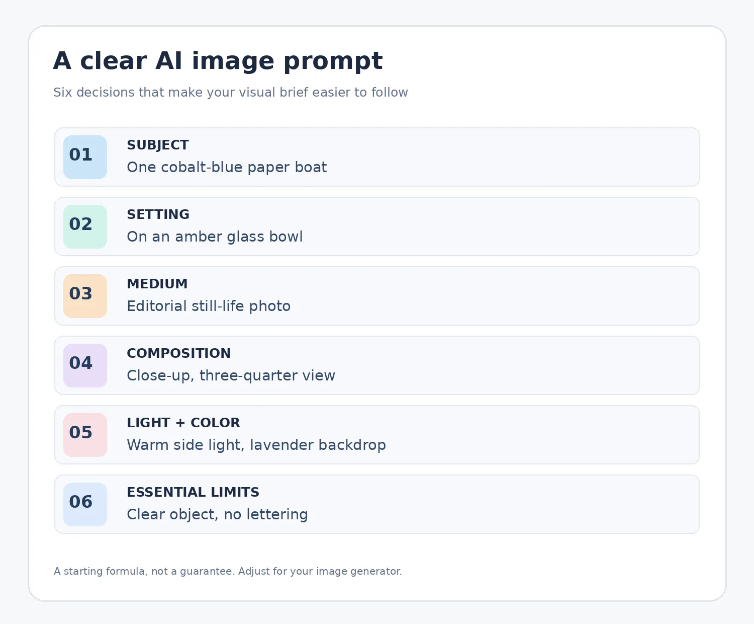
Quick start: the six decisions behind a clear prompt
Think of these as six questions, not six boxes you must fill with adjectives. The goal is clarity, not length.
Turn a vague idea into a visual brief
Start with the weak prompt: “A beautiful paper boat.” This identifies an object but leaves nearly every visual decision to the generator.
A more useful version is: “A deep cobalt-blue origami sailboat balanced on the rim of a translucent amber glass bowl, on a smooth ivory pedestal in a pale lavender studio. Close three-quarter view, warm light from the side, visible paper folds, elegant orange reflections, clean background, no lettering.”
Now the scene has one focal object, a recognizable material, a specific position, a viewpoint, and lighting that explains the reflections. The illustration accompanying this guide was generated for LORQAI from a related brief. It is an example of what a directed description can communicate—not a controlled before-and-after experiment or a promise that every model will produce the same image.
A reusable starting formula is: SUBJECT + SETTING + MEDIUM + VIEWPOINT + LIGHT/COLOR + IMPORTANT LIMITS. Put the most important decision near the beginning. Remove any detail that does not change what you actually want to see.
1. Name the main subject clearly
“A curious creature” leaves a lot open. “One small ceramic fox carrying a yellow umbrella” gives the generator a focal point. Counts help when they matter, but do not rely on words alone to guarantee an exact number of complex objects.
2. Choose a consistent visual medium
A documentary photograph, a linocut print, and a watercolor illustration behave differently. Pick one primary visual language first. Mixing every fashionable style word—“photorealistic, flat vector, oil painting, cinematic, pixel art”—usually makes the brief less coherent unless the contrast is deliberate.
3. Describe the frame and the empty space
A good picture can still fail its purpose if the edges are cropped. If you need an entire lamp visible, say “full object in frame with breathing room around it.” For a website banner, ask for a wide composition with clear negative space where the headline will go. Use the tool's aspect-ratio controls when available instead of relying only on “vertical” or “horizontal” in the prompt.
4. Replace vague mood words with visible clues
“Dreamy” may be interpreted in many ways. “Diffuse morning light through mist, pale peach and muted blue, soft shadows” gives visual clues that create a mood. Choose two or three dominant colors only when that restriction supports the design.
5. Describe materials, not just adjectives
“Beautiful shiny object” is weak. “Brushed steel, frosted glass, folded cotton paper, or rough unglazed ceramic” gives the generator something tangible to depict. If the result feels too plastic or glossy, revise the material description before rewriting the entire scene.
6. Give negative instructions a small role
Say what you want first. Add a short essential exclusion such as “no lettering or logos” only when useful. Some generators have separate negative-prompt fields or parameters; others interpret exclusions as ordinary language. There is no universal negative-prompt syntax that works the same everywhere.
7. Edit one meaningful variable at a time
If the lighting is right but the camera is too close, keep the subject and lighting and change the framing. If the composition is right but the palette is wrong, edit the color description. Saving the previous prompt and output lets you understand which change helped rather than starting over randomly.
Ten copy-ready image prompts
These are original prompts designed as flexible starting points. Each is paired with a practical reason for the choices. They have not been tested as a controlled comparison across different image generators. Choose the appropriate aspect ratio in your tool and adapt the wording to your own subject.
Example 1 — Clean product photography
Prompt: “One matte sage-green ceramic desk lamp with a curved neck, standing on a pale stone shelf against a warm off-white wall. Realistic editorial product photograph, three-quarter viewpoint, soft daylight from the left, gentle natural shadow, whole lamp visible with empty space around it, no brand or lettering.”
Use this when the object's shape and finish must be clear. If the lamp is cropped, request a wider view rather than adding more decorative props.
Example 2 — Children's-book illustration
Prompt: “A tiny hedgehog trying to carry an enormous striped umbrella through a garden of blue flowers. Hand-painted gouache illustration for a children's picture book, rounded friendly shapes, visible brush texture, eye-level framing, warm afternoon light, playful mood, no words.”
A single funny action makes the story legible. The medium and soft shapes support the intended audience.
Example 3 — Botanical macro photograph
Prompt: “A single dew-covered violet petal photographed from extremely close range, fine surface texture and individual droplets in crisp focus, dark teal background falling gently out of focus, controlled side lighting, quiet scientific-art aesthetic, no text or labels.”
Use a clear focal detail. This is artistic macro imagery, not a botanical reference photograph you should treat as scientific evidence.
Example 4 — Impossible architecture
Prompt: “A monumental concrete pedestrian bridge forming one continuous vertical loop above an empty sand-colored plaza. Wide architectural concept visualization viewed slightly from below, one distant human silhouette for scale, overcast daylight, restrained neutral palette, detailed concrete surface, no lettering.”
The impossible shape is the subject. The small figure establishes size; the wide camera angle leaves enough room to understand the structure.
Example 5 — Food editorial photograph
Prompt: “Overhead photograph of a lemon tart with one slice removed, centered on a powder-blue ceramic plate, folded linen napkin and two whole lemons at the upper edge. Soft natural window light, crisp pastry texture, cream and muted blue palette, generous tabletop space, no hands, no words.”
The overhead position makes the arrangement easy to follow. Only a few supporting objects compete with the food.
Example 6 — Minimal geometric poster
Prompt: “An abstract vertical poster made of three overlapping paper-cut circles and one diagonal stripe. Flat screen-print aesthetic with subtle paper grain, ultramarine blue, coral red and warm ivory only, asymmetrical balance, strong negative space, clean edges, no text or logos.”
This is suited to an artwork that will later receive typography in a graphics editor. The no-text requirement avoids relying on uncertain lettering generation.
Example 7 — Cinematic landscape
Prompt: “A small silver train crossing a long viaduct above a misty golden meadow at sunrise. Distant panoramic landscape photograph, low clouds, soft amber light touching the train, cool blue shadows in the valley, quiet atmosphere, train fully visible and small within the wide scene.”
The subject is intentionally small; saying that explicitly can prevent the train from taking over the composition.
Example 8 — Original fictional character
Prompt: “Three-quarter portrait of an original fictional astronomer with cropped silver hair, round protective glasses and a dark forest-green field jacket inside a compact observatory. Natural expression, soft blue window light, warm instrument glow behind, editorial portrait photograph, head and shoulders fully visible, no lettering.”
A distinct outfit, setting and framing give you a starting point for a character. For consistency across a series, a permitted visual reference is usually more useful than relying on text alone.
Example 9 — Handmade textile art
Prompt: “A square handwoven wall tapestry showing simple desert flowers and a winding river. Straight-on gallery photograph against a warm neutral wall, irregular hand-finished edges, visible cotton and wool threads, faded turquoise, terracotta and cream palette, diffuse daylight, no frame or writing.”
Material imperfections are part of the design. The straight-on view makes the textile itself the focus.
Example 10 — Surreal cover-art concept
Prompt: “One tiny aged-brass key floating inside a large translucent violet soap bubble over a charcoal-gray studio floor. Square conceptual cover artwork, centered focal point, dramatic negative space, delicate rim light, realistic metal and glass-like reflections, limited violet and graphite palette, no typography or logos.”
The one unusual idea is easy to remember. Keeping the background simple leaves flexibility for later design work.
What to change when the result is wrong
Use the visible problem to select your next edit. Do not automatically append ten new adjectives.
What to change when the result is wrong — key points
- The wrong object appears: begin the prompt with the correct subject and remove competing subjects.
- The layout is wrong: specify “left,” “right,” “foreground,” “background,” or “overhead view,” and simplify the scene.
- The object is cut off: request a wider shot, more space around the subject, and the appropriate aspect ratio.
- The material looks fake: replace broad words such as “luxury” with specific surfaces such as linen, ceramic, wood or brushed metal.
- The image feels too busy: limit the props and use a plain background or negative space.
- The lettering is incorrect: check each letter; when exact typography matters, consider adding it later in a design tool.
- The same character changes between scenes: use an authorized image reference, character sheet or consistent-editing controls if the generator offers them.
What to change when the result is wrong
Image generation is not a deterministic blueprint. Two runs may differ even when the prompt stays the same. Evaluate the output, make a targeted change and keep the best versions.
Make a consistent series instead of ten unrelated pictures
If you are illustrating a story or producing a collection, save a short visual brief: the overall medium, palette, key materials, lighting approach, character details and image dimensions. Treat those as stable decisions. Change the action or scene intentionally instead of rewriting the entire look from scratch each time.
Some image tools provide style references, composition references, image editing or character-related guidance. Features and strength settings vary by product and model. Use only images you have permission to supply, and check the results for continuity. A reference can improve consistency but cannot guarantee an identical face, outfit, prop count or layout in every generation.
A short checklist before you press Generate — key points
- Can a reader identify the main subject in the first sentence?
- Is the desired medium clear?
- Does the framing fit the place where the image will appear?
- Are the light and color choices specific without contradicting each other?
- Have you kept only the constraints that truly matter?
- If this belongs to a series, are you using the same approved references?
- Will you review the actual output instead of assuming the prompt guarantees accuracy?
Is a longer prompt always better?
No. Detail helps only when it clarifies the picture. Midjourney's official guidance emphasizes short, clear prompts, while Adobe Firefly encourages direct, descriptive language. The useful principle shared by both is to make choices visible rather than padding a prompt with adjectives.
Do I need special technical words or camera settings?
Usually not. “Overhead photograph in soft morning light” is often a clearer starting point than a string of simulated camera specifications. Add technical detail when you know exactly what effect you want and your tool supports it.
Should prompts always be written in English?
Not necessarily. Many tools accept multiple languages. Write in a language that lets you express the scene accurately, then test another wording if your model misunderstands a specific phrase.
Can I guarantee the same character in every image?
No. A consistent description helps, but character continuity often requires supported reference or editing tools and careful manual review. Text alone is not a guarantee.
Can I generate a poster with exact words?
Some current tools can generate or edit lettering, but text can still need proofreading or adjustment. For crucial names, dates or prices, verify the rendered words and consider placing them separately in a layout editor.
Can I publish every generated image freely?
Check the terms of the service, your rights to any uploaded references, and the rules of the destination platform. Do not assume that an online reference photo is free to reuse or that a generated image documents a real event.
Final thought
A successful prompt is not a secret incantation. It is a concise design decision: what matters, how it should look, and what the generator should prioritize. Start with a clear idea, inspect what comes back, and change the one thing that most improves the picture. That workflow is more useful than endlessly adding words.