Articles / LORQAI
The Banknote Has Another Way to Say Twenty
Why banknotes have raised dots, how money can be identified by touch, and the design decisions hidden in plain sight.
A teenager asks a simple question about money. A central bank changes its design. The remarkable story of the tiny raised marks that help people identify banknotes by touch.
By LORQAI
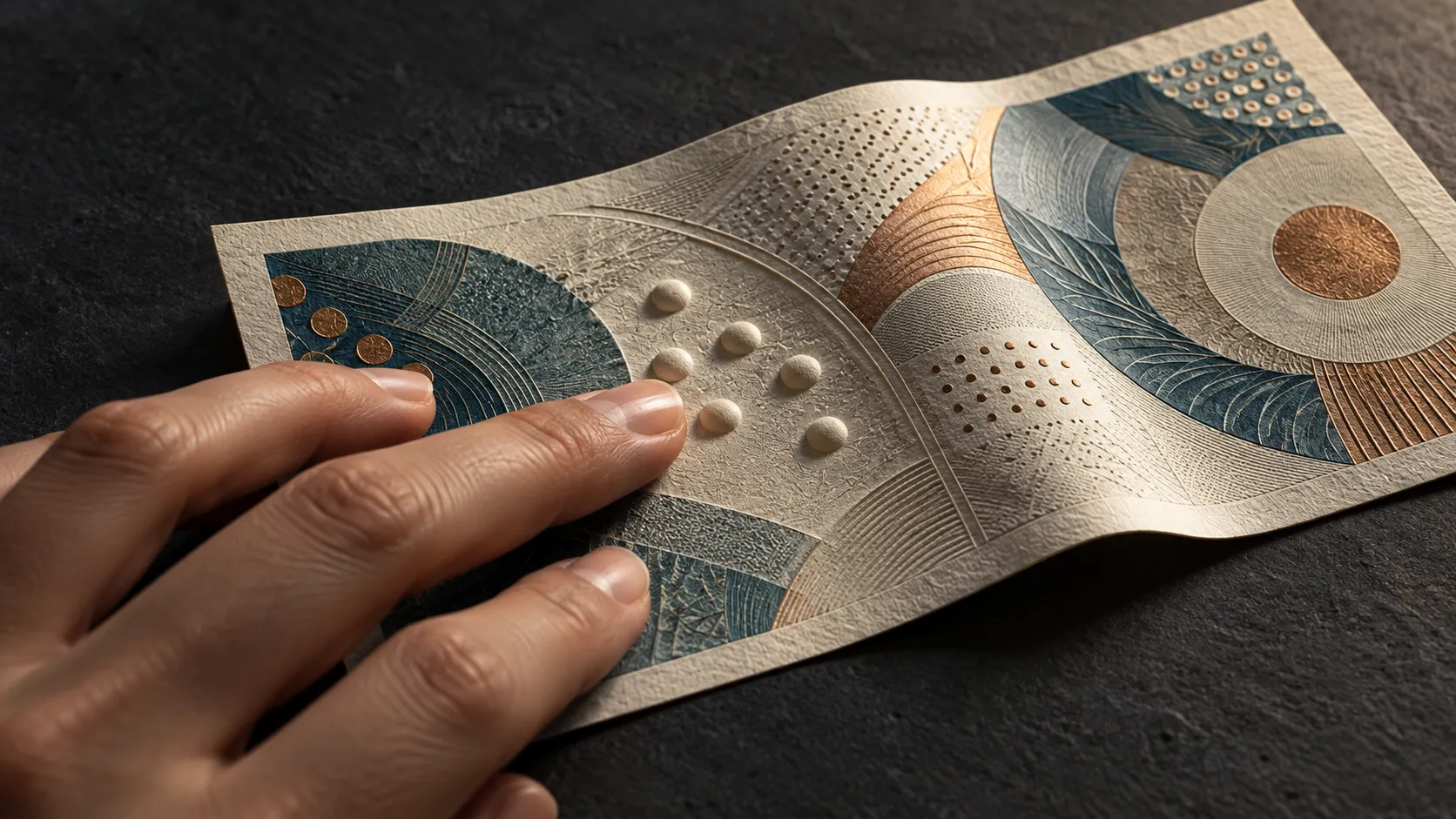
A Small Announcement
In February 2015, Australia's central bank announced that a future generation of banknotes would contain something new.
It wasn't a portrait. There would be no spectacular new hologram, no particularly dramatic invention involving color-changing ink. The announcement concerned small raised marks that people could feel with their fingers.
An outsider might reasonably have wondered why this required an announcement from a central bank.
The answer had something to do with a boy named Connor McLeod.
Connor, who was blind, had received money for Christmas and found himself unable to determine the value of the notes without asking someone else. He subsequently campaigned for tactile features to be added to Australian currency. When the Reserve Bank announced its decision, he was thirteen. His campaign had attracted public attention, and the bank described its own work as the result of research, technical trials and consultation with people who had vision impairments.
A tiny alteration was being made to one of the country's most familiar objects.
This is worth considering because money is an extraordinary collection of design decisions masquerading as something ordinary. Pick up a banknote and almost every visible feature is trying to communicate. The large numerals identify its value. Colors distinguish it from neighboring denominations. Portraits and illustrations establish an identity. Special windows, printing and other security features help people assess whether it is genuine.
There is information on the front, information on the back and sometimes information so small that you need magnification to see it.
But what happens when the most important information on the note cannot be read visually?
The answer, in several countries, has been to give the banknote another way of speaking.
A Twenty Is Not Always a Twenty
Imagine a hypothetical transaction.
You receive a banknote in change. You want to establish its value before putting it away. You might glance at the large printed number, notice the predominant color, or recognize the portrait. It takes very little thought because the information is familiar and directly available to you.
Now remove the visual part of the transaction.
The note still has a value, obviously. But the features that communicate that value to a sighted customer may no longer be useful. Two pieces of currency can feel similar while representing substantially different amounts of money.
This is a design problem with practical consequences.
Cash may be handed over in a shop, received as change, sorted at home or withdrawn from an ATM. Recognition should not require the person handling it to ask somebody else every time. An error might mean paying too much, accepting too little or simply having to stop and check.
People who are blind or have low vision use different methods to identify money. Some can distinguish large numbers or colors. Some use note sizes, tactile features, electronic tools or organized systems for keeping denominations separate. There is no single technique that works for every person.
That variety is exactly why banknote design cannot depend on one feature alone.
A useful note can communicate its denomination through several channels, allowing people to use the information they can access. Size is one possibility. Texture is another. Strong visual contrast helps people with some usable vision. Electronic recognition can provide an additional method when the physical design is insufficient.
The interesting challenge is that banknotes must also survive ordinary use.
They are folded, rubbed, carried in crowded wallets, passed across counters and occasionally sent through washing machines by people conducting involuntary experiments in textile care. Their physical features must remain reasonably useful after handling.
A code that works perfectly on a pristine design sample is much less impressive if it becomes difficult to distinguish in circulation.
Money has to be designed for the condition in which people actually receive it, not only the condition in which it leaves the printing works.
Five, Ten, Twenty, Fifty, One Hundred
Australia's solution is unusually easy to explain.
Its newer series of banknotes carries small raised bumps along both long edges, positioned near the transparent window. Different denominations have different numbers of bumps.
The five-dollar note has one bump on each edge. Ten dollars has two. Twenty has three. Fifty has four. One hundred has five.
No arithmetic beyond counting to five is required.
The underlying idea is straightforward: a person's fingers can identify a physical pattern instead of relying on the printed numeral. Other features remain available. Australian notes have different lengths, large contrasting numbers and distinct colors.
The tactile feature adds another route to the same answer.
There is an attractive economy to the arrangement. The five denominations form an ordered sequence, so the raised marks provide a consistent pattern that users can learn. The location of the bumps was also considered in relation to the way notes are held and stored.
Making this happen was rather less simple than deciding that small bumps would be a good idea.
The Reserve Bank and its printing operation had to investigate how the feature could be manufactured reliably. The new banknote series already involved sophisticated printing, protective coatings and security technology. The tactile marks had to be added without making the notes unsuitable for the machinery and handling systems they would encounter.
In the production process described by the bank, the raised feature was applied during a later stage of printing. It was part of a carefully planned manufacturing sequence, not an optional decoration pressed onto finished money by someone with an enthusiastic stationery tool.
The new five-dollar note entered circulation in September 2016.
The visible result was almost comically modest. A banknote already full of illustrations, transparent elements and intricate patterns acquired one more small feature.
Yet that particular feature had been designed to solve a problem that all the elaborate visual work had left unresolved.
The story also contains a useful reminder about how product improvements happen. They need not begin with a laboratory discovering an impressive material. Sometimes a user identifies a basic task that the existing product makes unnecessarily difficult.
Then a large institution has to work out how to change the product.
Australia did not invent the general idea of accessible money. Other currencies already used methods of distinguishing denominations by touch. What makes its redesign instructive is the combination of public campaigning, consultation, manufacturing and the eventual arrival of a new physical feature.
Something small had to pass through a very large system before it could reach an ordinary wallet.
Not Quite Braille
Look at a group of raised dots on a banknote and one explanation may immediately come to mind.
Braille.
It is a reasonable association, but often the wrong one.
Canada provides an especially interesting example. Canadian banknotes use groups of six raised dots arranged in two columns of three. At a glance, the arrangement resembles a Braille cell.
The Bank of Canada explicitly explains that its system is not Braille.
Instead, the number and position of the dot groups identify the denomination. Five dollars has one six-dot symbol. Ten dollars has two. Twenty has three. Fifty has four. The hundred-dollar note uses two symbols with a wider separation than the ten-dollar arrangement.
The distinction matters because recognizing a tactile pattern is not the same task as reading written language.
Braille is a writing system. Its characters encode letters, numbers and other information according to established conventions. A tactile currency code can be far simpler. It needs to distinguish a limited number of denominations quickly and consistently.
And not everybody who is blind reads Braille.
That fact influenced currency design. The Bank of Canada says its system was developed in consultation with people who were blind or had low vision, after research showed that Braille literacy could not be assumed among all users.
The dots therefore behave more like a small set of symbols than a miniature message written in a secret alphabet.
There is something pleasantly direct about this. A note worth twenty does not need to spell the word twenty under someone's fingertips. It needs to provide a pattern that can be distinguished from five, ten, fifty and one hundred.
Britain uses another arrangement.
Bank of England polymer banknotes have different sizes, and the higher denominations carry distinctive groups of raised dots. The five-pound note has no such dot clusters. Ten pounds has two clusters, twenty pounds has three and fifty pounds has four.
Again, the code does not need to resemble the printed number. It only needs to be learnable and recognizable.
The designs differ between countries because each issuer works within its own banknote dimensions, denominations, manufacturing processes and accessibility requirements.
This makes international travel an interesting test of the idea. A person familiar with one country's tactile marks cannot necessarily assume that another currency uses the same pattern.
The physical language of money is useful, but it is not universal.
The Same Problem, Several Ingenious Answers
A banknote designer has an awkward assignment.
The object must be difficult to counterfeit, durable enough for circulation, recognizable to the public, compatible with machines and practical for people with different sensory needs.
It must also remain a convenient size and shape. A fifty-pound note cannot become a small hardcover book merely because a larger surface would make room for more helpful features.
Designers therefore use combinations rather than relying on a single perfect solution.
In the euro area, banknotes incorporate size differences, strong colors, prominent numerals and raised printing. Different patterns of short raised lines appear near the edges of euro banknotes, providing tactile distinctions between denominations.
The Deutsche Bundesbank describes how representatives of the European Blind Union were involved from the early concept stage. The design was not simply examined for accessibility at the end, after all the major decisions had already been settled.
This is a different kind of sophistication from adding another hologram.
A hologram may be difficult to reproduce. A raised mark may be difficult to make both durable and distinguishable. Both require engineering, but they serve different jobs.
One helps establish authenticity. The other helps communicate information.
The two purposes can coexist on the same banknote, yet they should not be confused. The Reserve Bank of Australia specifically notes that its tactile bumps are accessibility features, not security features for verifying whether a note is genuine.
A convincing counterfeit could imitate a simple tactile mark. Feeling the correct number of bumps does not prove that the surrounding piece of material is authentic.
There is a similar design distinction in the choice of currency sizes.
Different-sized notes can help users separate denominations without relying on subtle texture. But a banknote's dimensions alone may be inconvenient to compare, especially if several notes are folded or held together.
Australia has provided a small measuring device that helps users distinguish notes by length. The device itself can be carried in a wallet.
That sounds almost absurdly specialized until one remembers how many ordinary tools exist because the human hand is excellent at some comparisons and less precise at others.
A ruler is not a failure of visual perception. A thermometer is not an admission that people should have tried harder to feel the weather. Tools exist because measurement can be made more reliable.
Accessible money benefits from the same practical attitude.
No single feature should have to solve every problem for every user.
The Printing Press Meets a Fingertip
A useful way to understand tactile currency design is to compare two inspections of the same banknote.
In the first, a designer examines an enlarged image on a screen.
Every line is crisp. Colors are exact. The numerals are perfectly legible. The raised feature may be represented by a diagram showing its location.
In the second, somebody handles the note.
It may be bent. The light may be poor. The person may need to identify its value quickly, with other objects in hand. The tactile feature has to compete with ordinary creases and the texture of the material itself.
The second inspection asks harder questions.
Where should the raised marks be placed so they can be found? How different must the patterns feel? What happens after repeated handling? Will the marks interfere with machines? Can the manufacturing process reproduce them consistently?
The answers depend on testing and on the people who are expected to use the product.
This is one reason consultation matters. Designers can invent a visually elegant system that proves awkward when used by touch. People familiar with the practical difficulties of handling cash can identify requirements that an attractive diagram may fail to reveal.
The Australian banknote redesign involved such consultation, alongside production trials. The physical feature that entered circulation was the outcome of that work.
There is also a wider question: who is imagined when an everyday product is designed?
Money passes through almost everyone's hands. The standard banknote is therefore a shared object in a way that many specialized devices are not. Its most fundamental task is to communicate value during a transaction.
If the value can only be determined through a sense that some users cannot rely on, the object has failed to provide equally accessible information.
That statement does not mean every person must interact with money in exactly the same way. They won't. Designing for accessibility is often a matter of offering several reasonable routes to a task, rather than insisting that one route suit everybody.
A large numeral can be genuinely useful to one person. A recognizable texture may be useful to another. Someone else might rely on a combination of features or an identification app.
The success of a design feature is ultimately measured by what it helps people do, not by how impressive it looks in the specification.
It is possible to make a banknote technologically elaborate and still leave an elementary task difficult.
It is also possible to improve that task with a series of dots.
The Part You Probably Never Noticed
Banknotes are designed to attract attention.
Their portraits are carefully chosen. Their colors are distinctive. They feature detailed illustrations, intricate patterns, windows and printing methods that make them unusually complex objects for something people often crumple into a pocket.
A curious person can spend a surprising amount of time studying a single note.
Yet the raised marks may go unnoticed by someone who has never needed them. They sit there among the countless other details, rarely asking for admiration.
That is perfectly acceptable. A feature does not have to demand attention from every user to justify its presence.
The next time you handle a banknote, you can look for the accessibility features described by its issuing bank. Depending on the currency, you may find groups of dots, raised lines, differences in size or combinations of these elements.
You may also discover that the note in your hand lacks the feature you expected, particularly if it belongs to a different country or an older series.
That variation is part of the story.
There is no universal banknote with a universally understood tactile code. There are many designs, each shaped by the decisions, compromises and priorities of its creators.
In one country, a group of dots may mean twenty. In another, twenty has a different pattern entirely.
The printed number can be read with the eyes. The raised code can be interpreted with the fingers.
The banknote is saying the same thing twice.
For an object whose purpose is to communicate a number, that seems like a remarkably sensible use of space.